Friday, January 20, 2017
Tracking the breakup of Sorosia
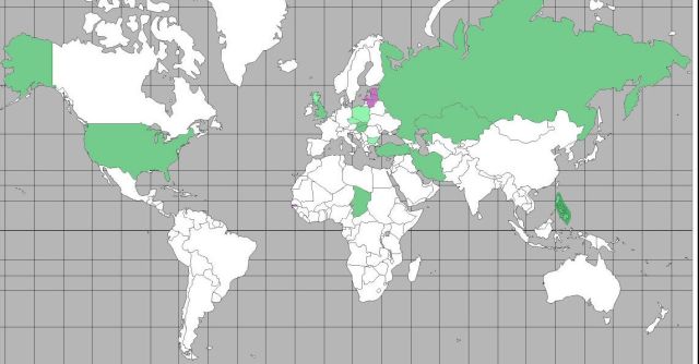
Noticing the opposite changes in Gambia and USA STRONG, I decided to start keeping track of countries that are moving IN and OUT of the Sorosphere. Today Gambia moved IN and USA STRONG started to move OUT.
 Green = AWAY FROM Sorosia.
USA STRONG, Russia, Turkey, Persia, Slovakia, Hungary, England, Poland, Bulgaria, Philippines, Kenya. I used lighter shades for weaker changes.
Purple = INTO Sorosia.
I'm seeing Gambia and the Baltics as recent moves TOWARD more Empire.
The map shows only recent changes, not pre-existing conditions. Most of Europe remains solidly Sorosian, and the Orient (China, Korea, Japan) remains solidly non-Sorosian.
= = = = =
Second edition here. Added one country on each side and corrected the placement of Kenya.
