Monday, August 08, 2016
Bad mapping
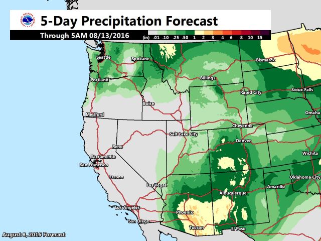
Good mapmakers pay attention to color combinations. Here's a classic example of a BAD color combination, from NWS. A map of likely precip over the next week...
 Is Tucson dry? No, it's much wetter than Seattle or Spokane. Pure white is zero, light eggshell-white is one inch.
You really don't need to be an expert to see why this is dumb.
Later: This color scheme is standard for contour maps of altitude, where it makes sense. Low land is greener, high land is browner. That's a "zero-centered" spectrum. Around 3000 feet the grass ends and the bare dirt begins. Even though rain quantity sort of parallels land color, this scheme doesn't work for a one-ended spectrum of rain quantity.
Is Tucson dry? No, it's much wetter than Seattle or Spokane. Pure white is zero, light eggshell-white is one inch.
You really don't need to be an expert to see why this is dumb.
Later: This color scheme is standard for contour maps of altitude, where it makes sense. Low land is greener, high land is browner. That's a "zero-centered" spectrum. Around 3000 feet the grass ends and the bare dirt begins. Even though rain quantity sort of parallels land color, this scheme doesn't work for a one-ended spectrum of rain quantity.Labels: Heimatkunde
