
Thursday, May 15, 2014
'JAPS QUIT' to 'SEEMS LEGIT' in one font
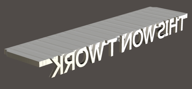
In the Linotype era, narrow fonts with no serifs were often used for screaming headlines. Such fonts disappeared in the '70s. Now they're back in a different context, but for the same reason as before.
The Linotype (and Ludlow) had strict limits on font size because the letters had to be cast as part of a fixed-size slug.
 Lead isn't strong enough to hold much of a cantilever. In practice you'd put blank slugs under the cantilevered part, but you'd still be asking for trouble. So BIG HEADLINES were set with single letters, assembled by hand in a composing stick. Often these letters were made of wood because big blocks of lead had too much inertia to stay in a form when it was slapping back and forth.
 Big individual letters were also used for theatrical posters or grocery store price posters, hence the common term 'Display fonts' or 'Poster fonts'. These fonts had to be simple with relatively constant line-width and no serifs, because lead couldn't tolerate a lot of strain at this large scale. Each part of the letter's structure had to be capable of taking tremendous pressure without breaking off.
Example: Look at the paper Polistra is holding. There are 8 big letters in the top part and maybe 5000 smaller letters in the lower half. Assuming the press exerts a ton of overall pressure, each big letter has to take 100 pounds, and each small letter takes about 3 ounces.
Big individual letters were also used for theatrical posters or grocery store price posters, hence the common term 'Display fonts' or 'Poster fonts'. These fonts had to be simple with relatively constant line-width and no serifs, because lead couldn't tolerate a lot of strain at this large scale. Each part of the letter's structure had to be capable of taking tremendous pressure without breaking off.
Example: Look at the paper Polistra is holding. There are 8 big letters in the top part and maybe 5000 smaller letters in the lower half. Assuming the press exerts a ton of overall pressure, each big letter has to take 100 pounds, and each small letter takes about 3 ounces.
 When commercial printing switched to photo offset processes in the '70s, Display fonts weren't needed. Bending strength and inertia were no longer relevant. Film and paper do have granular structures, but the grain is so tiny that it doesn't matter. For practical purposes offset printing is perfectly analog, perfectly continuous, perfectly scalable.
Display fonts have returned in the era of iphones. News sites and meme sites (i.e. suppliers of lies and suppliers of truth) strongly favor Display fonts.
Though every aspect of the technology has changed dramatically, Display fonts are needed again for the same underlying reason. Digital fonts are instantly scalable by the end user, which means any font must be readable in a wide variety of sizes and dots per inch.... but the granular structure of the pixels in the display imposes limits at the small end just as lead's granular structure imposes limits at the large end. If you want a word to remain readable when pixels threaten to break up the curves, the letters need to be simple with relatively constant line-width and no serifs.
When commercial printing switched to photo offset processes in the '70s, Display fonts weren't needed. Bending strength and inertia were no longer relevant. Film and paper do have granular structures, but the grain is so tiny that it doesn't matter. For practical purposes offset printing is perfectly analog, perfectly continuous, perfectly scalable.
Display fonts have returned in the era of iphones. News sites and meme sites (i.e. suppliers of lies and suppliers of truth) strongly favor Display fonts.
Though every aspect of the technology has changed dramatically, Display fonts are needed again for the same underlying reason. Digital fonts are instantly scalable by the end user, which means any font must be readable in a wide variety of sizes and dots per inch.... but the granular structure of the pixels in the display imposes limits at the small end just as lead's granular structure imposes limits at the large end. If you want a word to remain readable when pixels threaten to break up the curves, the letters need to be simple with relatively constant line-width and no serifs.


Lead isn't strong enough to hold much of a cantilever. In practice you'd put blank slugs under the cantilevered part, but you'd still be asking for trouble. So BIG HEADLINES were set with single letters, assembled by hand in a composing stick. Often these letters were made of wood because big blocks of lead had too much inertia to stay in a form when it was slapping back and forth.
Big individual letters were also used for theatrical posters or grocery store price posters, hence the common term 'Display fonts' or 'Poster fonts'. These fonts had to be simple with relatively constant line-width and no serifs, because lead couldn't tolerate a lot of strain at this large scale. Each part of the letter's structure had to be capable of taking tremendous pressure without breaking off.
Example: Look at the paper Polistra is holding. There are 8 big letters in the top part and maybe 5000 smaller letters in the lower half. Assuming the press exerts a ton of overall pressure, each big letter has to take 100 pounds, and each small letter takes about 3 ounces.
When commercial printing switched to photo offset processes in the '70s, Display fonts weren't needed. Bending strength and inertia were no longer relevant. Film and paper do have granular structures, but the grain is so tiny that it doesn't matter. For practical purposes offset printing is perfectly analog, perfectly continuous, perfectly scalable.
Display fonts have returned in the era of iphones. News sites and meme sites (i.e. suppliers of lies and suppliers of truth) strongly favor Display fonts.
Though every aspect of the technology has changed dramatically, Display fonts are needed again for the same underlying reason. Digital fonts are instantly scalable by the end user, which means any font must be readable in a wide variety of sizes and dots per inch.... but the granular structure of the pixels in the display imposes limits at the small end just as lead's granular structure imposes limits at the large end. If you want a word to remain readable when pixels threaten to break up the curves, the letters need to be simple with relatively constant line-width and no serifs.
Labels: 20th century Dark Age, Danbo
¶ 9:37 AM