Saturday, August 03, 2013
Sinuous halls and high centers
Most of the 1920's house plan books were full of good buildable livable plans. One notable exception (at least among those currently available) was Radford. Though Radford continued publishing for a couple of decades, his books included lots of wild ideas and really dumb plans along with some good straightforward bungalows.
Radford loved to draw long sinuous halls in places where they weren't needed. Halls are a good thing in moderation. Bungalow builders tended to omit halls entirely. Often the front bedroom opened directly into the living room, the back bedroom into the kitchen, and the bathroom could only be reached through the bedrooms. Perhaps Radford was rebelling against this tendency; if so, it was an overblown rebellion.
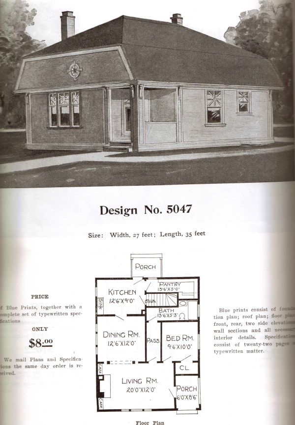
(1) Consider this plan for a small one-bedroom cottage. First, the style is bizarre, with a lowbrow clipped gable that looks Neanderthal. Second, the hall is completely unnecessary. The bedroom opens into the living room, and you have to go through a 10-foot hall to reach nothing but the bathroom!
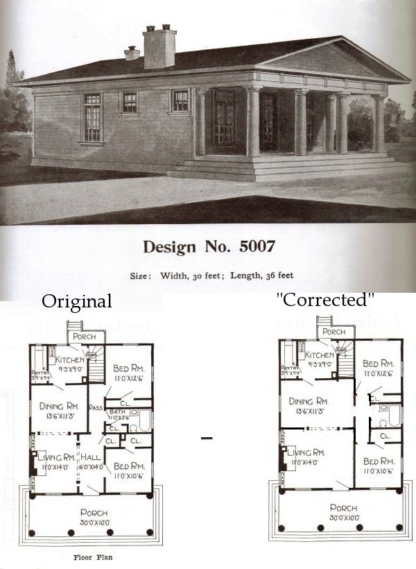
 (2) Huh? A Greek temple? Appropriate for a bank or church, but utterly wrong for a small house. Inside, the living room is wasted by a huge entrance hall that isn't a proper vestibule or a proper room. The bedroom opens into this entrance hall, and again the 'pass' leads clumsily to the back bedroom and bathroom. Most of the bathroom is unnecessary. I tried to improve the plan.
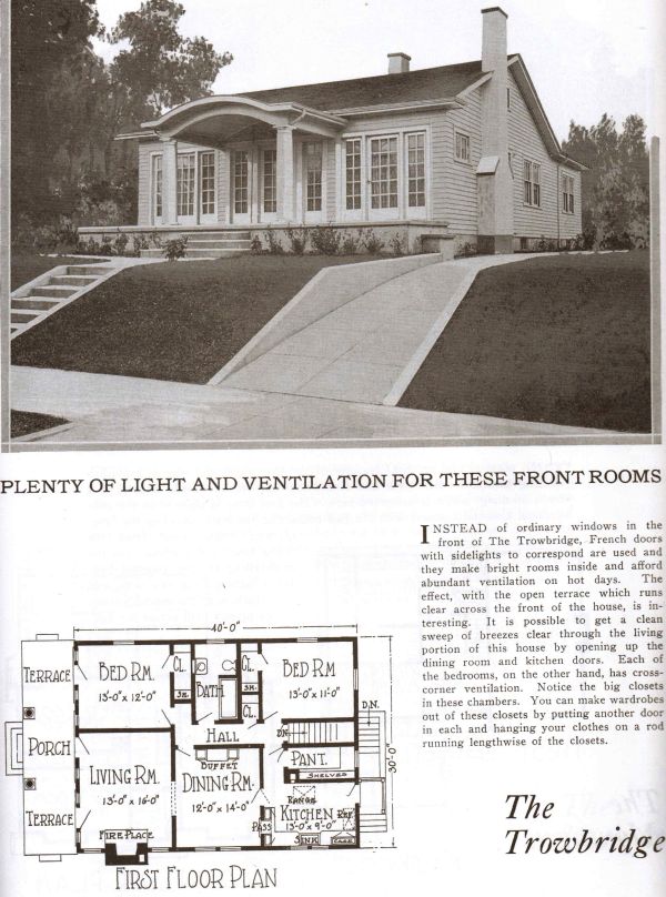
 (3) This one isn't obviously weird, but the huge front porch misses the whole point of a porch. It's not fully covered and doesn't shield the house from the sun; both front rooms have doors to the porch that defeat the front door and feel insecure. The hall is long and sinuous as usual, but probably useful. It seems to connect everything you'd want a hall to connect.
Mainly I included this picture for the driveway, which wasn't Radford's fault. Lots of pre-1940 houses on hilly terrain had sharply inclined drives like this. The bluffy parts of Manhattan and KC were full of them.
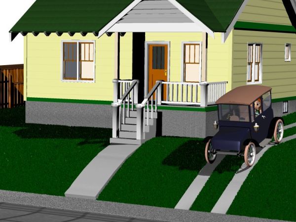
 Sharp driveways were just fine with pre-1940 cars, as Polistra illustrates. She sedately hums down the slope in her 1917 Detroit Electric, no bumps or scrapes anywhere.
 After 1955, American cars grew low and long with monstrous rear overhangs, and these driveways became car-destroying weapons. Mr Goldman is NOT HAPPY as his '61 Continental high-centers and burns out its transmission. Needless to say, the entire property was bombed down to bedrock 3 minutes after this picture was made. When Mr Goldman is NOT HAPPY, things happen.
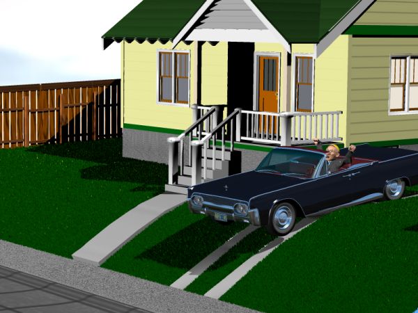 = = = = =
Artistic correction, sort of: After re-examining the Radford driveway, I finally realized that the drive itself is curved while the retaining walls are sharp. So it might not scrape the bottom of a '60s car, but it would scrape the doors off! Anyway, my digital model is still an accurate version of the real driveways I remember in Manhattan and KC. Apparently my eyes decided that the Radford picture agreed with those real driveways, and wouldn't switch away from the original impression even though I could see the curved part. Sort of like the young lady - old hag illusion.
 (2) Huh? A Greek temple? Appropriate for a bank or church, but utterly wrong for a small house. Inside, the living room is wasted by a huge entrance hall that isn't a proper vestibule or a proper room. The bedroom opens into this entrance hall, and again the 'pass' leads clumsily to the back bedroom and bathroom. Most of the bathroom is unnecessary. I tried to improve the plan.
 (3) This one isn't obviously weird, but the huge front porch misses the whole point of a porch. It's not fully covered and doesn't shield the house from the sun; both front rooms have doors to the porch that defeat the front door and feel insecure. The hall is long and sinuous as usual, but probably useful. It seems to connect everything you'd want a hall to connect.
Mainly I included this picture for the driveway, which wasn't Radford's fault. Lots of pre-1940 houses on hilly terrain had sharply inclined drives like this. The bluffy parts of Manhattan and KC were full of them.
 Sharp driveways were just fine with pre-1940 cars, as Polistra illustrates. She sedately hums down the slope in her 1917 Detroit Electric, no bumps or scrapes anywhere.
 After 1955, American cars grew low and long with monstrous rear overhangs, and these driveways became car-destroying weapons. Mr Goldman is NOT HAPPY as his '61 Continental high-centers and burns out its transmission. Needless to say, the entire property was bombed down to bedrock 3 minutes after this picture was made. When Mr Goldman is NOT HAPPY, things happen.
 = = = = =
Artistic correction, sort of: After re-examining the Radford driveway, I finally realized that the drive itself is curved while the retaining walls are sharp. So it might not scrape the bottom of a '60s car, but it would scrape the doors off! Anyway, my digital model is still an accurate version of the real driveways I remember in Manhattan and KC. Apparently my eyes decided that the Radford picture agreed with those real driveways, and wouldn't switch away from the original impression even though I could see the curved part. Sort of like the young lady - old hag illusion.
