Thursday, October 01, 2020
Learning by UXample
As I try to filter out reports of courseware problems, it seems that most of them are UX problems. Some are real. The problems in the Canvas LMS are real, but we didn't say that the courseware would work in Canvas, so that's a bit less urgent. Caveat emptor.
The UX problem seems to be: When the students are done with one lesson, they fall back to the main menu, and at that point it's not clear where they should go next. It feels like an error. There's no good indication of how to get out of the main menu. The main menu is shaped by the LMS, not by my courseware, so there's not much I can do about this, unless I add a 'fallback' page with instructions. That would require a major change, likely to create more problems than it solves.
Seeking guidance about this situation, I found a section on UX in Quora. The situation is well known in UX circles, and it's called the Zero State or Empty State.
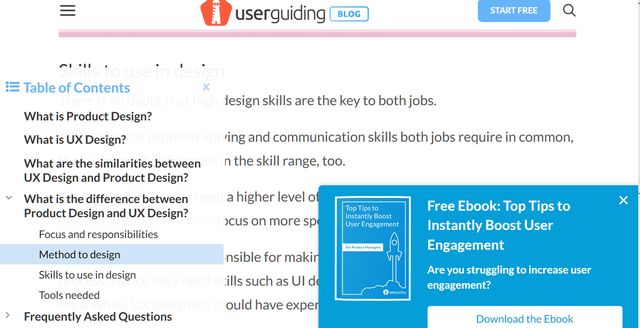
Some of the Quora items recommended reading the UserGuiding blog, which has an appropriate name. Okay, let's try it.
 Hmm. Not ideal UX, to put it mildly.
Later, I got a better handle on the problem. Some of the reports are 'Zero State' as above, but some are actually dropping out of the entire index when they should be falling back into the index, ready for the next selection. Now I have a real problem to solve, not a vague UX question.
Hmm. Not ideal UX, to put it mildly.
Later, I got a better handle on the problem. Some of the reports are 'Zero State' as above, but some are actually dropping out of the entire index when they should be falling back into the index, ready for the next selection. Now I have a real problem to solve, not a vague UX question.Labels: Bemusement, Entertainment
