Monday, July 25, 2016
iPhood
Couple years ago I noted the return of old woodcut fonts in a new form on Portable Cellular Telephonic Devices.
Everything is transitioning toward iPhone mode in style and fonts. Websites began as simple drab LONG scrolling pages, then developed into interesting layouts. Now they've returned to simple drab LONG scrolls.
Now canned food is going the iPhone route. Progresso Minestrone, old style and new style.
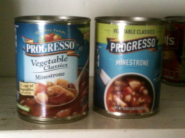 Same woodcut font as used in most iPhone stuff, and the layout is simpler and flatter and duller. Even the picture of the food is lower-quality. There's no physical reason to go this way. Just stupid fashion.
Fortunately the soup itself is unchanged. Still curvy, colorful and serifed.
¶ 4:45 PM
Same woodcut font as used in most iPhone stuff, and the layout is simpler and flatter and duller. Even the picture of the food is lower-quality. There's no physical reason to go this way. Just stupid fashion.
Fortunately the soup itself is unchanged. Still curvy, colorful and serifed.
¶ 4:45 PM 

Same woodcut font as used in most iPhone stuff, and the layout is simpler and flatter and duller. Even the picture of the food is lower-quality. There's no physical reason to go this way. Just stupid fashion.
Fortunately the soup itself is unchanged. Still curvy, colorful and serifed.
¶ 4:45 PM 