Friday, January 23, 2015
Just print it.
As long as I'm in random mode this morning....
Why do some 'magazine-type' websites insist on using video or audio instead of simple text? Video makes sense when the subject is visible and dynamic. A pretty girl or a tutorial with a sequence of screencaps. A live physics experiment or an animated graph. Video makes no sense for some old academic-type dude reading a text that HE ALREADY FUCKING WROTE IN THE FIRST FUCKING PLACE. An audio 'podcast' never makes sense under any circumstances. Utterly useless.
The text is already written. Just print the fucker.
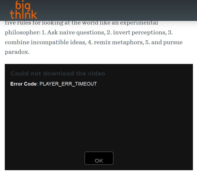
Video goes beyond annoying when it fails. The Big Think website is a major offender in this category. It has some articles that seem potentially interesting from the title and subhead. I'd gladly read them if they were just plain fucking printed. This morning I tried to open a stupid video that should have been a fucking text, and got this:
 Text doesn't cause PLAYER_ERR_TIMEOUT. Text ALWAYS displays, though it sometimes gets weirdly distorted by bad Responsive Web Design.
Later: Speaking of pretty girls and animated graphics ... KREM's weathergirl was having computer troubles, so she simply drew in the Warnings and Watches by hand.
 I love it when people find ways to GET THE DAMN JOB DONE regardless of Corporate Format Requirements.
 Text doesn't cause PLAYER_ERR_TIMEOUT. Text ALWAYS displays, though it sometimes gets weirdly distorted by bad Responsive Web Design.
Later: Speaking of pretty girls and animated graphics ... KREM's weathergirl was having computer troubles, so she simply drew in the Warnings and Watches by hand.
 I love it when people find ways to GET THE DAMN JOB DONE regardless of Corporate Format Requirements.
