Monday, April 23, 2012
Dust Bowl's Revenge 2
EconBrowser shows a map of unemployment by county, which echoes my earlier observation on the Dust Bowl's Revenge.
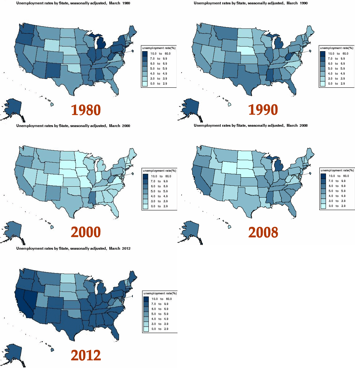
Using the BLS map maker, I ran up a little animation of state unemployment. The maps start at 1978, which means there's not much background or baseline on major trends. Still, the changes within these 30 years are instructive.

Note that the Dust Bowl (more precisely the Wheat Belt) holds its own during the whole period, even after the 2008 Goldman Coup when everything else turns dark.
Oil, industry, gummint jobs, and stock-based scams come and go elsewhere, but wheat is rock steady.
Note also the constant poor performance of Oregon and California, which ought to be outstanding successes by most standards. Different reasons, I suspect. Official Green Shit was destroying Oregon even before the EPA crashed the rest of the country. Calif has suffered from TOTALLY incompetent government, with the vast riches and resources of Hollywood enabling many bad administrations to fool the people and stay in power.
Using the BLS map maker, I ran up a little animation of state unemployment. The maps start at 1978, which means there's not much background or baseline on major trends. Still, the changes within these 30 years are instructive.

Note that the Dust Bowl (more precisely the Wheat Belt) holds its own during the whole period, even after the 2008 Goldman Coup when everything else turns dark.
Oil, industry, gummint jobs, and stock-based scams come and go elsewhere, but wheat is rock steady.
Note also the constant poor performance of Oregon and California, which ought to be outstanding successes by most standards. Different reasons, I suspect. Official Green Shit was destroying Oregon even before the EPA crashed the rest of the country. Calif has suffered from TOTALLY incompetent government, with the vast riches and resources of Hollywood enabling many bad administrations to fool the people and stay in power.
