Saturday, December 12, 2009
Fun with HADCRUT data sets
Now that the Hadley data sets are available, I decided to look at the Spokane set. This set consists of monthly averages from Jan 1881 through Oct 2009. The values are stated as departures from the single worldwide norm for each month, not actual temperatures. According to the HADCRUT website, some numbers have been adjusted in various ways, but the raw temps are not available.
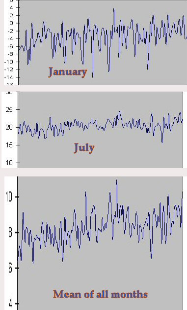
I imported the text-form data into an Excel file, then formed a yearly average in the rightmost column and graphed all January readings, all July readings, and the yearly means. I'm not proficient in Excel and couldn't figure out how to rescale the Y-axis, so I rescaled in Photoshop to make the Y-increment equal on all three.

The highest peak on the yearlies is 1958. (Which was - ahem - also the all-time top year for sunspots.) You can see that the recent pattern is down from '58 for a couple of decades then essentially flat, which agrees with worldwide temps.
Needless to say, nothing here remotely resembles a hockey stick.
Here's what strikes me: If I saw these output patterns on an oscilloscope while testing an electronic circuit like an amplifier, I'd know one thing for sure. I wouldn't know what the input looked like, nor the actual circuitry, but I'd know that the system had a padded ceiling and no floor. A soft saturation point on the upward side. Something is shunting off the energy as the readings go upward, but not as they head downward. The winter readings are free to go as low as the input wants to drive them.
I imported the text-form data into an Excel file, then formed a yearly average in the rightmost column and graphed all January readings, all July readings, and the yearly means. I'm not proficient in Excel and couldn't figure out how to rescale the Y-axis, so I rescaled in Photoshop to make the Y-increment equal on all three.

The highest peak on the yearlies is 1958. (Which was - ahem - also the all-time top year for sunspots.) You can see that the recent pattern is down from '58 for a couple of decades then essentially flat, which agrees with worldwide temps.
Needless to say, nothing here remotely resembles a hockey stick.
Here's what strikes me: If I saw these output patterns on an oscilloscope while testing an electronic circuit like an amplifier, I'd know one thing for sure. I wouldn't know what the input looked like, nor the actual circuitry, but I'd know that the system had a padded ceiling and no floor. A soft saturation point on the upward side. Something is shunting off the energy as the readings go upward, but not as they head downward. The winter readings are free to go as low as the input wants to drive them.
