
Thursday, September 05, 2019
Gee thanks, Weather Bureau./// Edit: Not quite so bad
For a couple years the Weather Bureau was "promising" or really threatening to introduce a new format. The threat was postponed month after month, and finally the promise disappeared.
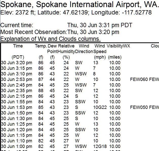
Here's the old format, from a screenshot I saved several years ago. It gave an hourly record of temp, wind, and precip, with finer time intervals optional. This was a USEFUL tool for checking the progress of fronts and storms, and seeing which parts of town had received the worst wind or rain.
 This week they abruptly introduced the new format.
 It's just a broad US map, which comes up centered on Denver for some reason.
When you zoom it in to the usual forecast area:
It's just a broad US map, which comes up centered on Denver for some reason.
When you zoom it in to the usual forecast area:
 It doesn't have a dot for Spokane! You have to zoom much closer to see the main airport, and even then the other Spokane sites aren't on it. There's no hourly record at all, so this is useless.
= = = = =
EDIT: They've re-added the record under a new link of "3 day history". I didn't notice the change.
¶ 5:06 PM
It doesn't have a dot for Spokane! You have to zoom much closer to see the main airport, and even then the other Spokane sites aren't on it. There's no hourly record at all, so this is useless.
= = = = =
EDIT: They've re-added the record under a new link of "3 day history". I didn't notice the change.
¶ 5:06 PM 

This week they abruptly introduced the new format.
It's just a broad US map, which comes up centered on Denver for some reason.
When you zoom it in to the usual forecast area:
It doesn't have a dot for Spokane! You have to zoom much closer to see the main airport, and even then the other Spokane sites aren't on it. There's no hourly record at all, so this is useless.
= = = = =
EDIT: They've re-added the record under a new link of "3 day history". I didn't notice the change.
¶ 5:06 PM 