
Saturday, May 25, 2019
Award for poor survey design
The city's website offered this WSDOT survey aimed at walkers and public transit users. Since I'm the target demo, I took the survey.
Atrocious design!
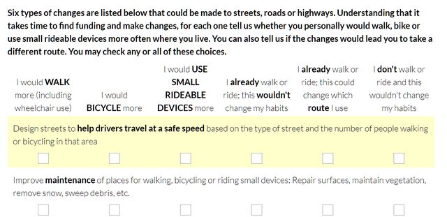 Faint gray outlines, clumsy blocking of text, poorly worded questions, vaguely distinguished choices. It would have been somewhat easier with the choices in rows instead of columns, but that wouldn't solve the wording.
Maybe this arrangement looks better on a Portable Cellular Telephonic Device, but I don't have a Portable Cellular Telephonic Device. I just have a computer. And there's some correlation between walkers and non-device users, so the survey is biased against the target demo.
¶ 12:18 AM
Faint gray outlines, clumsy blocking of text, poorly worded questions, vaguely distinguished choices. It would have been somewhat easier with the choices in rows instead of columns, but that wouldn't solve the wording.
Maybe this arrangement looks better on a Portable Cellular Telephonic Device, but I don't have a Portable Cellular Telephonic Device. I just have a computer. And there's some correlation between walkers and non-device users, so the survey is biased against the target demo.
¶ 12:18 AM 