Monday, June 11, 2018
Appropriate words, horrible graphics
Commercial art has improved tremendously in the last 50 years.
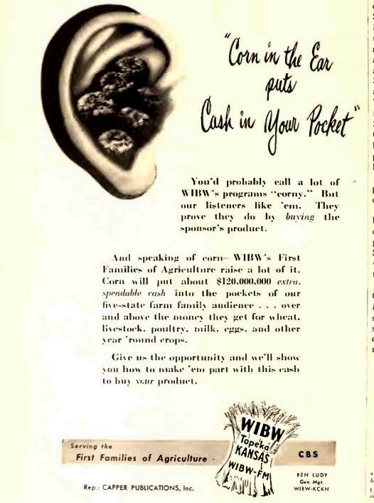
 From a 1948 trade journal aimed at NYC advertisers. The appeal for good old WIBW makes sense, resonating with NYC's automatic contempt and lethal hatred for humans. But the graphic leaves a LOT to be desired. Icky! Doesn't look like any recognizable form of corn; just looks like a horrible parasitic infection of the ear canal.
 From a 1948 trade journal aimed at NYC advertisers. The appeal for good old WIBW makes sense, resonating with NYC's automatic contempt and lethal hatred for humans. But the graphic leaves a LOT to be desired. Icky! Doesn't look like any recognizable form of corn; just looks like a horrible parasitic infection of the ear canal.
