Wednesday, March 02, 2016
Weather.com no longer reliable
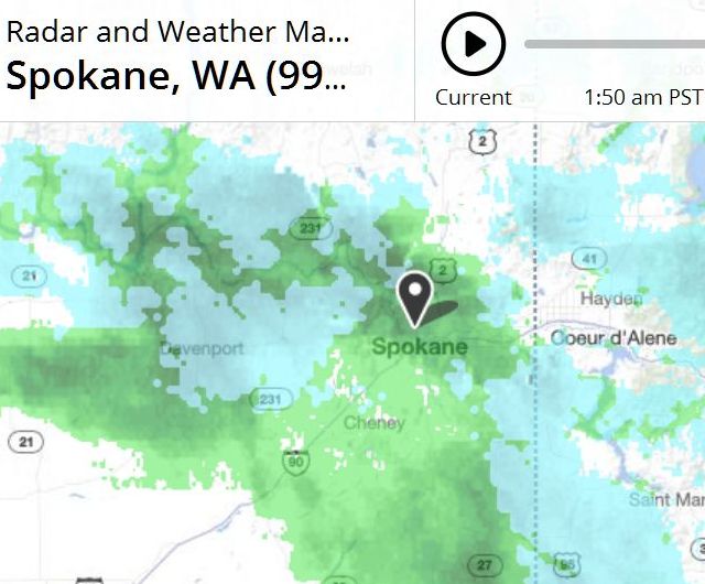
A few weeks ago weather.com switched their maps into Mobile Mode. As usual with those switches, the text became harder to read. Not quite as usual, the radar itself lost its perfect accuracy. Previously I could count on WC to tell me when the rain was coming. Where it's green, it's raining. Yellow meant super-heavy, and red meant full thunderstorm. Now they've turned up the colors by a full step. Green no longer means much of anything, and red means fairly heavy. Haven't had a real tstorm since the change, so I don't know how it will register. Probably purple and yellow stripes.
Radar right now shows dark green over us, which would have guaranteed steady rain before the change.
 But in fact it's not raining and hasn't been raining for a while.
= = = = =
Incidentally, there's a nice Firefox addon for these hard-to-read text sites. The fashion is light-gray screens and light-gray text. Maybe it looks good on those portable cellular telephonic devices, but I've never used one of those. Gray on gray is completely unreadable on a properly adjusted desktop monitor. A plugin called Blacken takes care of restoring those schemes to proper black-on-white. It also 'boldens' delicate fonts when needed.
 I suppose the name is Incorrect; should be called En Of Colour; but nevertheless it works like a charm.
 But in fact it's not raining and hasn't been raining for a while.
= = = = =
Incidentally, there's a nice Firefox addon for these hard-to-read text sites. The fashion is light-gray screens and light-gray text. Maybe it looks good on those portable cellular telephonic devices, but I've never used one of those. Gray on gray is completely unreadable on a properly adjusted desktop monitor. A plugin called Blacken takes care of restoring those schemes to proper black-on-white. It also 'boldens' delicate fonts when needed.
 I suppose the name is Incorrect; should be called En Of Colour; but nevertheless it works like a charm.
Labels: coot-proofing, Metrology
