Wednesday, April 29, 2015
Rich world problem
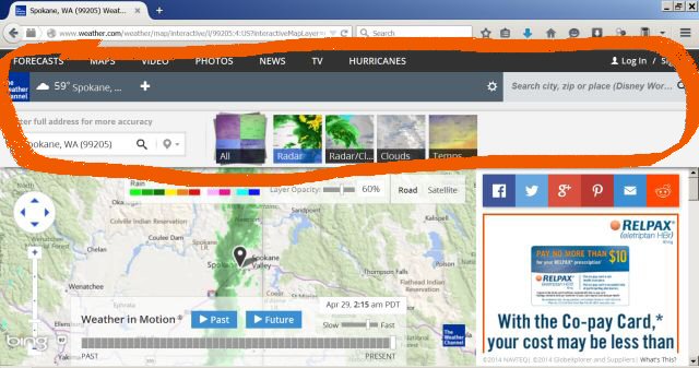
 Dammit, this is annoying. I don't mind ads, but the circled stuff is just totally pointless. It contains nothing commercially or softwarically necessary, and there's no way to get rid of it. The screen is more crap than map.
Paid subscriptions should include the privilege of wiping out ads and pointless crap.
Why doesn't this happen?
I've never run into any online business or service that makes a meaningful distinction between subscription versions and free versions. (Some specialized services like ScormCloud don't have a free version at all, which is fine. The cost is eminently worthwhile.)
Ordinary businesses always make a clear distinction. You might be able to gobble a couple of bite-size free samples in a grocery store, but you have to pay for a usable amount of food. This is how business has always worked offline.
Why not online?
A month later: Aha! It's possible to get a usable-size map after all. Easy but a little counterintuitive. Just use Ctrl-Minus to widen out the overall screen. You won't be able to read the text, but the whole square map is perfectly visible again. Excellent!
