Friday, August 03, 2012
Christy's minimum-temp hypothesis
John Christy's presentation of his hypothesis about rising minimum temps makes great intuitive sense. I'd been thinking along the same lines; UHI certainly keeps Tmin high, and that could be the source of higher averages.
It's already obvious that a global spatial average is nonsense. Each spatial region has its own independent patterns and trends. Christy is now starting to show that a temporal average is also nonsense. Each 'temporal region', such as night vs day and summer vs winter, has its own independent patterns and trends.
Let's try to compare a good long-term non-urban vs urban record, focusing on temporal regions.
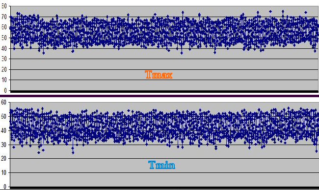
For the non-urban, try Armagh found here. This goes back to 1853 for rain, but the min and max temps start at 1865.
Sorted out the text so it included only the full rows of max/min, ran up an Excel (here) and then a graph.
The Met Office records are in degrees C; I converted to degrees F so humans can understand it. X axis runs from 1865 to 2012.

Note that the data points are monthly min and max, which makes a highly crowded line graph ... but the net effect gives you a pretty good 'envelope' of the seasons. The top edge of the 'envelope' in each graph is summers, and the bottom edge of the 'envelope' is winters.
Well, do we see anything special about the present? Nope. Not in the min or max. I can see a period in the 1990s when the winter max was sort of high, but it doesn't beat the 1865-1885 range.
= = = = =
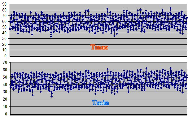
For a more urban site, here's the same stuff for Heathrow airport. This series starts in 1948, so the scale looks different and we can't see the big curve (down from 1865 then back up) that shows in Armagh.

Note that the min temp has a definite and steady upward trend for this urban site.
= = = = =
Armagh is a small city with lots of green, and Ireland has very little air conditioning.
So: If the 'temporal region' of min temps is rising, it has to be UHI. It's asphalt and compressors, nothing else.
It's already obvious that a global spatial average is nonsense. Each spatial region has its own independent patterns and trends. Christy is now starting to show that a temporal average is also nonsense. Each 'temporal region', such as night vs day and summer vs winter, has its own independent patterns and trends.
Let's try to compare a good long-term non-urban vs urban record, focusing on temporal regions.
For the non-urban, try Armagh found here. This goes back to 1853 for rain, but the min and max temps start at 1865.
Sorted out the text so it included only the full rows of max/min, ran up an Excel (here) and then a graph.
The Met Office records are in degrees C; I converted to degrees F so humans can understand it. X axis runs from 1865 to 2012.

Note that the data points are monthly min and max, which makes a highly crowded line graph ... but the net effect gives you a pretty good 'envelope' of the seasons. The top edge of the 'envelope' in each graph is summers, and the bottom edge of the 'envelope' is winters.
Well, do we see anything special about the present? Nope. Not in the min or max. I can see a period in the 1990s when the winter max was sort of high, but it doesn't beat the 1865-1885 range.
= = = = =
For a more urban site, here's the same stuff for Heathrow airport. This series starts in 1948, so the scale looks different and we can't see the big curve (down from 1865 then back up) that shows in Armagh.

Note that the min temp has a definite and steady upward trend for this urban site.
= = = = =
Armagh is a small city with lots of green, and Ireland has very little air conditioning.
So: If the 'temporal region' of min temps is rising, it has to be UHI. It's asphalt and compressors, nothing else.
Labels: Blinded by Stats, Carbon Cult
