Monday, December 26, 2011
Century temperature animated
Got bored and felt like doing something graphical, so decided to rig up an animation of Wash state temperatures. The data is derived from these NCDC sets, for the 10 'climate divisions' of Wash.
Now that I've got the graphics and data processing built, I'll re-use them soon for precip and wind, and possibly for wind turbines, bat population, and pine beetle infestations to examine this connection. For now I figured the plain temperature map might be interesting to someone.
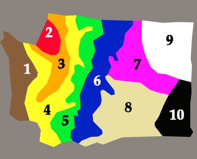
The underlying data is annual temperature averages from 1911 to 2011, with each year starting in September. First the map in still form, with the division numbers on it:

1 is the super-rainy Olympics; 2 is ocean and the San Juan Islands; 3 is Seattle-Olympia urban area; 4 doesn't have a name that I know of; 5 is West Slope of Cascades; 6 is East Slope of Cascades; 7 is Okanogan Highlands (including Grand Coulee); 8 is lower Basin (semi-desert); 9 is Northeast Mountains; 10 is Palouse.
Spokane sits at the T between 7, 9, 10. The horizontal bar of the T sometimes shows up in storm movements as a sharp linear barrier blocking progress of a northward-moving storm. You can imagine a very high wall along that line!
= = = = =
In the animation, black is the lowest annual temp and bright red is the highest. Annuals range from 40F for the coldest year (1955, zone 5 west Cascades) to 54F for the hottest year (1934, semi-desert zone 8). So the distinction between black and brightest red is only about 14F altogether. Most of the zones stay close to 48F most of the time.
Here's the animation in an embedded Windows Media Player, which may or may not work in your browser:
If it doesn't work, or you want to play with it offline, here's the movie file by itself. It's about 2 megabytes:
Download this.
= = = = =
Now here's the annual precipitation done the same way from the same set of data. Again the dark (closest to black) is the lowest precip, and the bright is the highest.
The max and min here are much more impressive: Rainiest year was 1997 in the Olympics (zone 1) with 137.5 inches. Dryest year was 1924 in semi-desert zone 8, at 5.2 inches. Another impressive thing is the effect of the Cascades rain shadow. As Niña and Niño years alternate, the rain coming from the Pacific varies widely; but after the Cascade wringer does its job, the zones east of the mountains scarcely change.
And again if it doesn't work, or you want to play with it offline, here's the movie file by itself.
Download this.
Now that I've got the graphics and data processing built, I'll re-use them soon for precip and wind, and possibly for wind turbines, bat population, and pine beetle infestations to examine this connection. For now I figured the plain temperature map might be interesting to someone.
The underlying data is annual temperature averages from 1911 to 2011, with each year starting in September. First the map in still form, with the division numbers on it:

1 is the super-rainy Olympics; 2 is ocean and the San Juan Islands; 3 is Seattle-Olympia urban area; 4 doesn't have a name that I know of; 5 is West Slope of Cascades; 6 is East Slope of Cascades; 7 is Okanogan Highlands (including Grand Coulee); 8 is lower Basin (semi-desert); 9 is Northeast Mountains; 10 is Palouse.
Spokane sits at the T between 7, 9, 10. The horizontal bar of the T sometimes shows up in storm movements as a sharp linear barrier blocking progress of a northward-moving storm. You can imagine a very high wall along that line!
= = = = =
In the animation, black is the lowest annual temp and bright red is the highest. Annuals range from 40F for the coldest year (1955, zone 5 west Cascades) to 54F for the hottest year (1934, semi-desert zone 8). So the distinction between black and brightest red is only about 14F altogether. Most of the zones stay close to 48F most of the time.
Here's the animation in an embedded Windows Media Player, which may or may not work in your browser:
If it doesn't work, or you want to play with it offline, here's the movie file by itself. It's about 2 megabytes:
Download this.
= = = = =
Now here's the annual precipitation done the same way from the same set of data. Again the dark (closest to black) is the lowest precip, and the bright is the highest.
The max and min here are much more impressive: Rainiest year was 1997 in the Olympics (zone 1) with 137.5 inches. Dryest year was 1924 in semi-desert zone 8, at 5.2 inches. Another impressive thing is the effect of the Cascades rain shadow. As Niña and Niño years alternate, the rain coming from the Pacific varies widely; but after the Cascade wringer does its job, the zones east of the mountains scarcely change.
And again if it doesn't work, or you want to play with it offline, here's the movie file by itself.
Download this.
Labels: Carbon Cult
